How to Use Color Gradients in Web Design

Color isn’t just a visual treat—it’s one of the strongest tools in a designer’s toolkit. A smart use of color can guide users, set a mood, and bring personality to a brand. One technique that has recently made a massive comeback in modern interfaces is the color gradient.
Gradients are no longer those dated rainbow backgrounds from the 90s. Today, they’re sleek, subtle, and used smartly to bring depth, emotion, and texture into flat digital spaces. Learning how to use gradients effectively can truly level up your web design skills. That’s why more aspiring designers are turning to structured programs like a Web Designing Course in Chennai, where creative design principles are taught with a modern twist.
So, What Exactly is a Color Gradient?
A gradient, in simple terms, is a transition between two or more colors. It can be linear (colors blending from left to right or top to bottom), radial (spreading out from the center), or even angular and conic depending on the style you're going for.
Modern gradients are often soft, elegant, and purpose-driven. They’re used to highlight call-to-action buttons, create engaging backgrounds, or simply give a website an artistic flair.
Why Gradients Work So Well in Web Design
Gradients give flat designs a sense of depth and movement. They add a dynamic visual experience that can be both eye-catching and functional. When used with intention, gradients can:
-
Direct user attention to key areas like forms or buttons
-
Replace stock images or boring solid backgrounds
-
Add emotion or personality to your brand’s tone
-
Modernize the overall look of your website
When diving into a Web Development Course in Chennai, designers often explore how front-end elements like gradients work in tandem with user interaction. It's not just about colors it’s about purpose.
Choosing the Right Colors for Your Gradient
Before applying a gradient to your design, consider your brand's identity. Are you going for bold and energetic? Or soft and elegant?
Here are a few tips when choosing colors:
-
Stick to your palette: Use brand colors or complementary tones.
-
Use color theory: Opposite colors on the color wheel create vibrant transitions, while neighboring shades produce subtle effects.
-
Experiment with transparency: Adding opacity or overlays can create a more layered feel.
-
Keep accessibility in mind: Make sure text or buttons placed on gradient backgrounds remain readable.
Practical knowledge like this is what differentiates self-taught learners from those who’ve enrolled in a Full Stack Developer Course in Chennai, where visual design, frontend implementation, and UX considerations are all covered holistically.
Best Places to Use Gradients in Your Website
Let’s take a look at how you can implement gradients effectively across different sections of a web page:
1. Backgrounds
Instead of using solid blocks of color, you can use a soft gradient to create a clean yet interesting canvas. It helps avoid the “flat” look and can instantly modernize your layout.
2. Hero Sections
The hero banner is the first thing visitors see, so it needs to make a statement. A bold gradient can set the tone and immediately draw attention.
3. Buttons and CTAs (Call-To-Actions)
Gradients can give your CTA buttons a tactile feel—making them stand out without being too flashy.
4. Overlays on Images
Using a transparent gradient over an image can help darken or lighten it, making white or black text more readable while adding a stylish touch.
5. Icons and Illustrations
Flat icons get an extra edge with gradient fills, especially in modern, minimal designs.
During practical sessions in a Training Institute in Chennai, students are often encouraged to experiment with these elements, testing them on real-world web layouts.
Tools and Resources to Create Stunning Gradients
The good news? You don’t have to be a color wizard to create amazing gradients. There are tons of tools out there to help you choose and implement the perfect gradient.
Here are a few favorites:
-
CSS Gradient Generator: Helps you copy-paste CSS code directly for linear and radial gradients.
-
UI Gradients: Offers a curated list of beautiful, modern gradients ready to use.
-
Coolors Gradient Tool: Allows you to build custom gradients and export color codes.
-
Adobe Color: Great for experimenting with palettes and understanding color theory.
Common Mistakes to Avoid
While gradients are powerful, using them carelessly can create clutter or reduce usability. Here are a few pitfalls to steer clear of:
-
Too many colors: Keep it simple. Two or three tones are usually enough.
-
Harsh transitions: Avoid jarring shifts in color unless you’re aiming for a dramatic effect.
-
Poor contrast: Always ensure readability of text over gradients.
-
Overuse: Gradients should highlight, not overwhelm. Use them purposefully.
Following best practices helps in crafting clean, professional websites that appeal to users and perform well across devices.
Gradients can be your secret weapon in making a website not only look beautiful but also feel intuitive and engaging. When done right, they breathe life into digital interfaces and elevate the user experience without saying a word.
الأقسام
إقرأ المزيد
"Executive Summary Aseptic Carton Packaging Market : Global Aseptic Carton Packaging Market size was valued at USD 26.10 Billion in 2024 and is projected to reach USD 49.02 Billion by 2032, with a CAGR of 8.20% during the forecast period of 2025 to 2032. In addition to the insights on market scenarios such as market value, growth rate, segmentation, geographical coverage, and...
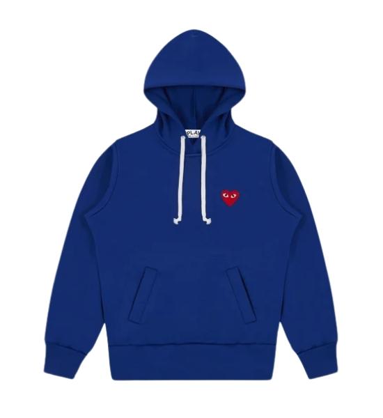
Comme des Garçons isn't always only a name in fashion—it's miles a shift in how human beings think about fashion. For years, this logo has been breaking traditional fashion guidelines and creating new ways to explicit identification via apparel. It brings a clean meaning to trendy elegance by way of pushing creative limitations at the same time as staying genuine to its ambitious...
"Executive Summary Sheet Metal Fabrication Services Market : CAGR Value The global sheet metal fabrication services market size was valued at USD 12.69 billion in 2024 and is expected to reach USD 17.50 billion by 2032, at a CAGR of 4.1% during the forecast period. This Sheet Metal Fabrication Services Market report has several aspects of marketing...
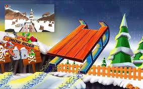
If you’re seeking a delightful and exhilarating game to help you unwind after a long day, Snow Rider is an excellent option that’s sure to captivate your attention. This enchanting snowboarding game takes you on a thrilling journey down never-ending snowy slopes, packed with unexpected obstacles and delightful surprises. What truly sets Snow Rider apart from...
المفهوم الشامل لدور شركة التسويق الحديثة في عالم الأعمال المتسارع اليوم، لم يعد المنتج المتميز أو الخدمة الاستثنائية كافيين للنجاح. فمع تزايد الضوضاء الرقمية والمنافسة الشرسة، أصبح الوصول إلى العميل المستهدف والتأثير فيه تحدياً معقداً يتطلب استراتيجية محترفة. هنا يبرز الدور الحيوي لـ شركة التسويق التي تحولت من مجرد أداة دعائية إلى شريك استراتيجي للنمو. لماذا لم يعد التسويق التقليدي كافيًا لنمو...