Creative Typography Ideas for Custom Printed Boxes
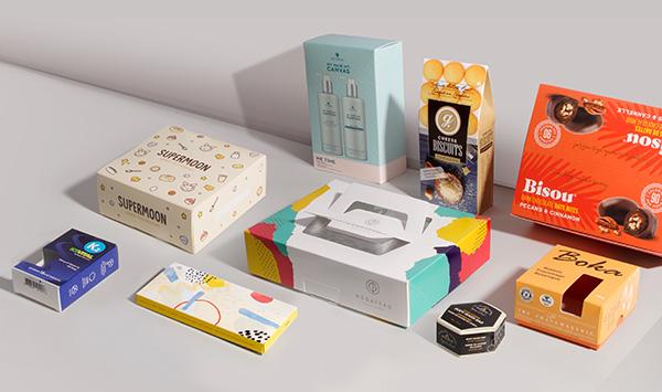
Effective typography encompasses much more than just letters and words; it includes the brand name, logo, the install, and interaction, and resonates with the brand’s emotional tone. The custom boxes seeks to use custom printed boxes with creative typography to position your brand effectively. Let’s explore some captivating typography to leave a long-lasting impression on the audience.
1. Sans Serif Fonts for Clean, Modern Packaging
Sans serif typography includes well-known fonts such as Future, Helvetica, and Montserrat. Sans serif fonts are popular choices for aesthetic and high-end packaging. The use of bold and clear designs on printed boxes directly amplifies the effectiveness of the boxes, making the phrase ‘The Custom Boxes’ more appealing.
Sans serif fonts grab the audience's attention with bold letters and, being clean fonts, attract their gaze with their effortless readability.
2. Handwritten & Script Fonts for a Personal Touch
Script or handwritten fonts are appropriate for artisanal or handmade products. They provide a measure of authenticity and warmth to your packaging. This is especially effective with Kraft or eco-friendly boxes that aim to promote the uniqueness of the product’s handmade nature.
Typography Tip
Strive for simplicity with a serif typeface to ensure legibility with script font combinations while keeping the overall design approachable.
3. Visual Hierarchy for Better Readability
Incorporate a hierarchy of different font sizes and weights to guide the reader for better interaction with the content. Use large, bold text to highlight the brand name, a lighter weight for the tagline, and supporting details in a smaller size.
While printing on branded cardboard boxes, employing a strong hierarchy of type helps ensure that the most critical information is noticed first, including product name, features, and call to action.
4. Creative Letter Spacing and Layout
Design alteration through the spacing of letters and layout is the easiest and most effective change in typography. Elegantly styled fonts with increased spacing evoke a sense of luxury. Custom printed packaging can also be brought to life through dynamically angled or curved text.
Typography Design Example
A brand name inscribed diagonally on the box lid communicates a modern boldness, whereas a centered, spaced arrangement conveys equilibrium and professionalism.
5. Vintage Typography Evoking Nostalgia
Custom packaging design is now witnessing a resurgence of retro-inspired fonts. They evoke feelings of nostalgia, tradition, and dependability, making them ideal for gourmet, organic, or crafted brands.
Employing serif fonts embellished with artistic borders on custom food boxes projects a ‘heritage brand’ image, appealing to customers seeking authenticity.
Typography Tip
Enhance the aged look by pairing weathered typefaces with intricate backgrounds and soft-focus hues.
6. Focus on Typography as the Core Design Element
Fonts can, indeed, ‘save’ a packaging design. Consider typefaces as the major design components. Using box panels as blank canvases, expansive type can be placed on the boxes, with some elements crossing from one face to another.
This bold design direction is to be cherished and will only be elevated by custom rigid boxes designed for gifting or PR sets.
Typography Strategy
Capturing consumers’ attention can be achieved with bold statements such as “PURE,” “NATURAL,” or “CRAFTED,” dominantly displayed and sized. Active and powerful phrases or single words are most effective.
7. Color and Contrast as Visual Enhancement for Typography
Remember that typography entails color as well. Using high contrast color combinations for text: white on black, or gold on navy, creates a visually striking effect.
Alternatively, tone-on-tone color schemes, like beige on cream or dark gray on black, tend to evoke a more understated, yet sophisticated elegance.
Bespoke typography incorporates foil-stamped or UV gloss finishes, which turn lettering into textural elements and transform your boxes into multidimensional works of art.
8. Multilingual Typography for a Wider Global Reach
For companies that distribute products across the globe, complying with multilingual typography not only meets regulations but also captures trust and brand equity.
While employing a dual language type can also serve as an artistic accent, it provides fresh design opportunities with space and contrast.
Typography Application Tip
While creating bespoke boxes for cosmetics or supplements, the typography should allow for breezy translation without congesting the design.
Conclusion
Irrespective of the choice of design elements and composition: bold modern fonts for sleek aesthetics or script styles for a handcrafted feel, the primary focus needs to be on the brand and design coherence. Typography needs to be given more focus in custom box design, as it is an essential yet overlooked resource.
At Packaging Forest LLC, we assist brands in realizing their visions by providing bespoke boxes that are printed to capture attention both digitally and physically.
الأقسام
إقرأ المزيد
"Executive Summary Self-Healing Hydrogels Market : Self-healing hydrogels market is expected to gain market growth in the forecast period of 2021 to 2028. Data Bridge Market Research analyses the market to account to grow at a CAGR of xx% in the above mentioned forecast period. This Self-Healing Hydrogels Market research report is a proven and consistent source of...
Executive Summary Mobile Biometric Authentication and Identification Market Size and Share Across Top Segments Data Bridge Market Research analyses that the mobile biometric authentication and identification market which was growing at a value of 4.13 billion in 2021 and is expected to reach the value of USD 11.86 billion by 2029, at a CAGR of 14.10% during the forecast period of...
ORDER NOW : https://healthyifyshop.com/OrderKetoPowerGummies Keto Power Gummies are more than just a supplement—they’re a lifestyle booster for anyone following the keto path. They combine science-backed ingredients with convenience, making weight loss goals more achievable without sacrificing taste. FOR MORE INFORMATION : ...
The global Frozen Bakery Products Market has been experiencing significant momentum, fueled by evolving consumer preferences, busy lifestyles, and the rising adoption of convenience foods. These products—ranging from bread, cakes, and pastries to pizza crusts and croissants—are gaining popularity as they offer both long shelf life and consistent quality, catering to the demands of...
The city of Mumbai is known for its vibrant nightlife, luxury lifestyle, and endless opportunities for entertainment. In recent years, the concept of companionship services has evolved, giving rise to professional male companionship. A Gigolo in Mumbai or a male escort gigolo offers discreet, stylish, and engaging company for women who are looking for more than just casual interaction. Among...