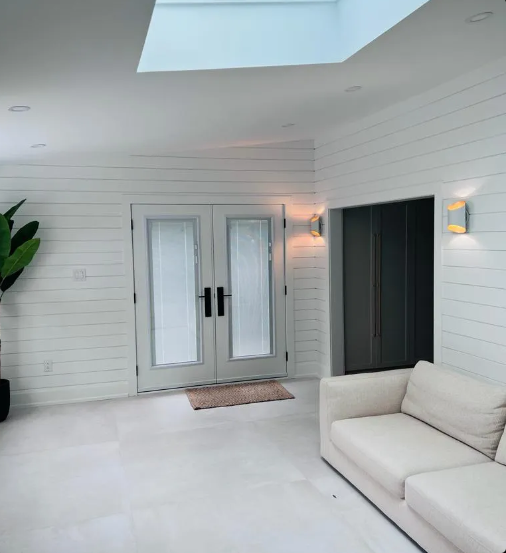
A Guide to Colour Consultation for Your Home’s Interior

Choosing colours for your home seems easy until you’re knee-deep in paint charts and second-guessing every shade. I remember painting my own bedroom once — thought I’d nailed it with a “warm neutral” from the shop. Under my own lights, it looked flat and cold, and I ended up repainting the whole room a month later.
That was when I realised why people bring in professional painters. They’re not only there to handle the brushes — many of them guide you through colour choices as well. They understand how sunlight makes a colour shift, how different finishes affect mood, and which tones actually sit well together once the paint dries. It’s advice grounded in experience, not guesswork.
Getting that sort of help upfront saves you from the disappointment of walls that looked perfect on a swatch but feel completely wrong at home.
Why colour consultation matters
Colour changes everything. It can make a tiny lounge feel spacious, or a bright room feel calm. Done well, it connects rooms together instead of each one feeling like its own little world.
Reasons people lean on painters for this step:
-
To avoid clashing tones that look good alone but awful together
-
To work with the light, not against it
-
To keep consistency between spaces without going boring
-
To balance personality and practicality
I once painted a bedroom a pale blue. Looked fine in the store. At home in the morning light? It felt like sleeping in a fridge. A painter later explained it was the window direction pulling the cool tones forward. It would’ve saved me a weekend if I’d asked first.
The importance of licence requirements in NSW
Before you even get to colours, there’s something basic people forget: licences. In NSW, there are painting licence requirements that certain jobs fall under. Sounds boring, but it’s there to protect you.
When someone has a licence, it means they’ve hit the standards and can be held accountable. Without it, you’re taking a punt.
When I had my old place repainted, I asked the painter straight up. He rattled off his licence number without blinking. That one moment told me he was serious about his work, and it made it easier to trust his colour advice later on.
How professionals guide the colour process
It’s not a one-size-fits-all thing. Good painters actually look at how you live.
They’ll usually:
-
Walk around your home to see how light shifts during the day
-
Put sample swatches on your walls, not just hand you cards
-
Ask how each room gets used
-
Suggest accents that don’t overpower the main colours
One painter once had me put three test patches on a wall. At first, they looked almost the same. But by evening, under warm light, they were totally different. I ended up going with the one I’d nearly dismissed. That’s the sort of guidance you don’t forget.
Considering commercial spaces too
Homes are one story, but offices, shops, or shared spaces are a different game. This is where Sydney commercial painters earn their keep.
They’ve seen how colour affects people in those settings.
-
Neutrals for calm and focus in offices
-
Bright pops to energise shops or cafes
-
Brand colours used in a way that’s not overbearing
I remember an office that shifted from beige walls to soft greens. Nothing else changed — same furniture, same lights — but suddenly the whole space felt fresher. People even commented on feeling less drained. That wasn’t luck. It was colour planning done right.
The role of finishes in consultation
You can pick the perfect colour, but the wrong finish will ruin it. A glossy navy feels completely different to a flat matte navy.
What I’ve seen work:
-
Matte softens but marks quickly
-
Satin balances elegance and practicality
-
Gloss is durable but shows every flaw underneath
I made the mistake of going matte in a hallway. Loved the look. Hated the scuffs that showed up a week later. A painter laughed and said, “Mate, satin’s your friend in busy spots.” He wasn’t wrong.
Creating flow between rooms
Every room doesn’t need to be the same, but they should connect. Otherwise, walking through your home feels disjointed.
Some ways painters do this:
-
Use one base tone across rooms, tweak it slightly each space
-
Drop in accent walls where they’ll actually work
-
Stick with a palette that feels consistent rather than random
At my place, using a soft neutral throughout gave me the freedom to add colour where it made sense. Bedrooms got bolder, but they still felt like part of the same house. That’s the sort of balance that sounds simple but isn’t without guidance.

Thinking beyond interiors
Even though we’re talking interiors, what’s outside still matters. A bold exterior can fight with the colours inside if there’s no link between them. That’s where knowing a few exterior painting tips can help tie things together.
For example, a lighter exterior can handle stronger accents inside, while darker exteriors often call for warmer interior tones to balance the feel. I had a grey-blue outside paired with cool whites inside once. Didn’t work. The painter suggested warmer whites indoors to connect things, and suddenly it felt like it all belonged together.
Final thoughts
Colour consultation isn’t just about chasing trends or copying a magazine spread. It’s about making choices that suit the way you live and the home you’re in.
Painters bring more than just brushes. They notice light shifts, how colours interact, and how finishes play out in real life. And when you throw in their licence, their experience with commercial spaces, and their knowledge of how interiors and exteriors link — it’s clear they’re not just painting walls. They’re shaping how a place feels.
And once you’ve had both — the rushed DIY choices and the guided consultation — you see why it’s worth it.
Κατηγορίες
Διαβάζω περισσότερα
Are you tired of using inferior photo editing software that doesn't meet your expectations? Do you need a powerful tool that can help you achieve professional-grade results? Look no further than Crackaty, your ultimate download resource for the latest and greatest in digital content. In this article, we'll explore the benefits of using Photoshop cracked, the most popular image editing software...
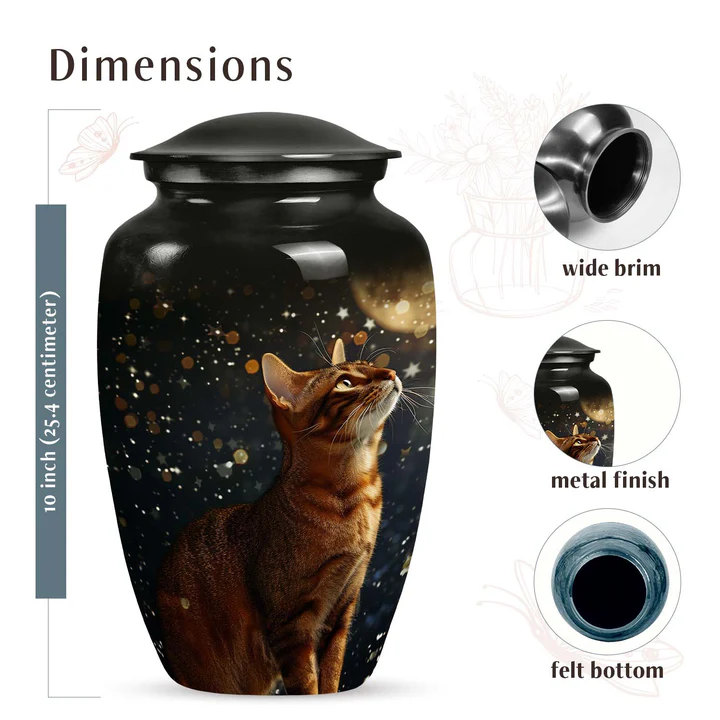
For those who have loved and lost a pet, the silence that follows is often overwhelming. Pets are not just companions; they are family members who leave behind paw prints on our hearts. Their departure can create a void that is hard to fill. In these moments, memorials like cremation urns provide a sense of peace, offering a tangible way to keep their memory alive. Among the wide selection...
When it comes to finding a keynote speaker on leadership, it can be overwhelming to sift through the vast pool of options available. However, there are certain qualities and characteristics that set apart a truly great keynote speaker on leadership from the rest. In this article, we will explore what makes a keynote speaker stand out in the realm of leadership and how you can identify and...
At Cyberpunk Outfit, we are committed to bringing together one of the most stylish and futuristic concepts incorporated in apparel from the glow of neon-lit dystopian cyberpunk. Be it true to the very last cell of your blood or a wannabe looking for edgy and bold futurism. Whatever your taste, our collection is your natural choice to stand out. From cyberpunk jackets to cyberpunk...

When it comes to enhancing your home, few projects offer as much potential as a basement renovation in Oakville. Basements are often underutilized, serving as storage areas rather than fully functional living spaces. With thoughtful design and expert craftsmanship, a dark and unused basement can be transformed into a stylish, practical, and comfortable extension of your home. From entertainment...