What Is Data Visualization and Key Techniques Explained
In today’s digital economy, businesses generate and consume enormous amounts of data every day. While raw numbers contain valuable insights, they are often overwhelming and difficult to interpret without proper context.
This is where data visualization becomes essential. It transforms complex information into charts, graphs, dashboards, and interactive displays that allow decision-makers to identify patterns, trends, and correlations with ease. By using visual elements, organizations can communicate information clearly and improve both strategic planning and real-time decision-making.
Why Data Visualization Matters for Modern Businesses
Data visualization is more than just presenting numbers in an attractive way. It is about unlocking understanding. Executives and teams can make faster, evidence-based decisions when data is translated into intuitive visual stories. This process helps highlight hidden opportunities, track business performance, and predict future outcomes. For industries such as healthcare, finance, retail, and manufacturing, visualization is the bridge between complex data sets and actionable insights.
Core Principles of Effective Visualization
At its heart, data visualization relies on clarity, accuracy, and context. A visualization should not distort or overcomplicate information. It should focus on relevance and simplicity, ensuring that every stakeholder—whether technical or non-technical—can interpret the insights presented. Good visualizations balance aesthetics with functionality, presenting data in ways that enhance comprehension without overwhelming the viewer.
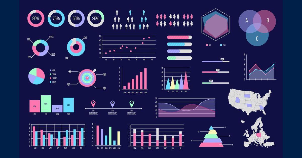
Popular Data Visualization Techniques
Over time, several visualization methods have emerged as widely used standards in analytics. Each serves a specific purpose, depending on the type of data and the insights required.
Charts and Graphs
Bar charts, line graphs, and pie charts remain fundamental tools for representing numerical values. They are effective when comparing performance, analyzing trends over time, or breaking down proportions within a data set.
Heat Maps
Heat maps use color variations to indicate data density or intensity. They are especially useful for analyzing geographic trends, website behavior, or resource distribution within organizations.
Dashboards
Dashboards compile multiple visualizations into one central interface, providing a snapshot of key performance indicators. They allow executives to monitor real-time business operations and adapt quickly to changes.
Scatter Plots
Scatter plots reveal relationships and correlations between variables. They help organizations identify anomalies, outliers, and predictive patterns that may not be visible in standard reports.
Infographics
Infographics combine visual storytelling with data points to create engaging content. They are particularly effective in communicating findings to external audiences, clients, or stakeholders without technical backgrounds.
Data Visualization in the Context of Analytics
Visualization cannot stand alone without structured data processing. That is why organizations often rely on professional data analytics services to prepare, clean, and interpret their information before visualization begins. Data that is inaccurate or inconsistent can lead to misleading graphics, which is why combining analytics with visualization is critical for business reliability.
Choosing the Right Data Visualization Service Providers
With the rapid adoption of digital technologies, many organizations turn to data visualization service providers to streamline this process. These providers deliver expertise in designing visualization strategies, selecting the right tools, and ensuring that visuals align with business objectives. Partnering with specialists ensures that companies maximize the impact of their data and reduce the risks associated with poor representation.
Role of Managed Data in Visualization Success
Data quality and accessibility remain the foundation of effective visualization. Without clean, organized, and securely managed data, visuals lose accuracy. Many businesses rely on data managed services to handle the complexities of collection, storage, and governance. By centralizing and maintaining data effectively, companies can ensure that their visualization projects always reflect reliable and current information.
The Future of Data Visualization
The evolution of artificial intelligence and machine learning has already started reshaping the visualization landscape. Predictive analytics, automated dashboards, and real-time interactive models are becoming mainstream. Instead of static graphs, organizations now demand dynamic interfaces that update automatically and provide contextual recommendations. This trend ensures that data visualization will continue to play a central role in digital transformation strategies for years to come.
Common Challenges in Data Visualization
Despite its benefits, visualization also presents challenges. Misrepresentation of data, overuse of flashy graphics, or ignoring the audience’s level of understanding can lead to confusion rather than clarity. Furthermore, without proper security protocols, sensitive business data could be exposed in visual dashboards. Successful visualization strategies require technical expertise, governance policies, and continuous refinement.
FAQs about Data Visualization
What is data visualization in simple terms?
Data visualization is the process of converting raw data into visual formats such as charts, dashboards, or infographics to make information easier to understand and interpret.
Why is data visualization important in business?
It helps decision-makers quickly grasp insights, spot trends, and make informed choices without needing to analyze complicated spreadsheets or raw data sets.
Which industries benefit most from data visualization?
Sectors like healthcare, finance, retail, marketing, logistics, and manufacturing benefit heavily, as they generate large amounts of data daily that need fast interpretation.
What are the most common data visualization techniques?
Some of the most widely used methods include bar charts, line graphs, dashboards, heat maps, scatter plots, and infographics. Each serves different purposes depending on the type of data.
How do managed services improve visualization results?
Managed services ensure that the underlying data is accurate, secure, and consistently updated. This makes the resulting visualizations more trustworthy and actionable.
Conclusion
Data visualization is no longer a luxury—it is a necessity for organizations aiming to remain competitive in data-driven markets. By adopting the right visualization techniques, aligning with experienced service providers, and maintaining strong data management practices, businesses can transform complex numbers into powerful insights. The result is not only clearer decision-making but also stronger strategies that shape future growth.
الأقسام
إقرأ المزيد
Overview: Cricket is more than just a sport in India—it’s a passion that unites millions of fans. With the rise of online betting platforms, this passion has extended into the digital world where cricket betting IDs have become a crucial element for secure participation. A cricket betting ID is more than just a username or account number; it acts as a gateway that allows players to...

"Executive Summary Asia-Pacific Acute Myeloid Leukemia Diagnostics Market : The Asia-Pacific acute myeloid leukemia diagnostics market is expected to grow in the forecast period of 2023 to 2030. Data Bridge Market Research analyzes that the market is growing with a CAGR of 11.1% in the forecast period of 2023 to 2030 and is expected to reach USD 1,206.57 million by 2030. An...
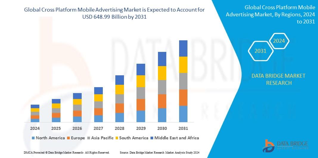
Detailed Analysis of Executive Summary Cross Platform Mobile Advertising Market Size and Share Global cross platform mobile advertising market size was valued at USD 138.47 billion in 2023 and is projected to reach USD 648.99 billion by 2031, with a CAGR of 21.30% during the forecast period of 2024 to 2031. When market research report is brilliant and precise, it proves to be a backbone...
Istilah slot gacor belakangan ini menjadi perbincangan hangat di kalangan pecinta judi online, khususnya permainan slot. Slot gacor secara harfiah berarti mesin slot yang mudah memberikan kemenangan atau sering keluar jackpot. Pemain yang berhasil menemukan slot gacor biasanya merasa lebih beruntung dan bisa mendapatkan keuntungan lebih besar dalam waktu singkat. Oleh karena itu, banyak orang...

Life is a beautiful journey, but it often presents us with challenges that can leave us feeling lost, drained, and stuck. Whether you're facing persistent obstacles in your career, turmoil in your relationships, a general sense of unhappiness, or unexplained health issues, these problems can have roots that go deeper than the physical world. This is where the guidance of a genuine spiritual...