Top Mistakes to Avoid When Installing ADA Directional Signs
When it comes to making your business space accessible and compliant, ADA directional signs play a crucial role. These signs are not only required by law under the Americans with Disabilities Act (ADA), but they also help visitors, customers, and employees navigate your space with ease. From office buildings and retail stores to hospitals and schools, ADA directional signs ensure everyone—including people with visual or physical impairments—can find their way.
However, many businesses unintentionally make mistakes when installing these signs. These errors can lead to non-compliance fines, poor visitor experience, and accessibility challenges. To help you avoid these pitfalls, here are the top mistakes to avoid when installing ADA directional signs.
1. Placing Signs at the Wrong Height
One of the most common mistakes is installing ADA directional signs at the wrong height. According to ADA guidelines, tactile signs must be mounted between 48 inches and 60 inches from the ground. This ensures that they are accessible to individuals in wheelchairs as well as those standing. Installing signs too high or too low makes them difficult to read or touch, creating barriers for people who rely on them.
Tip: Measure carefully before installation and ensure consistency throughout your building.
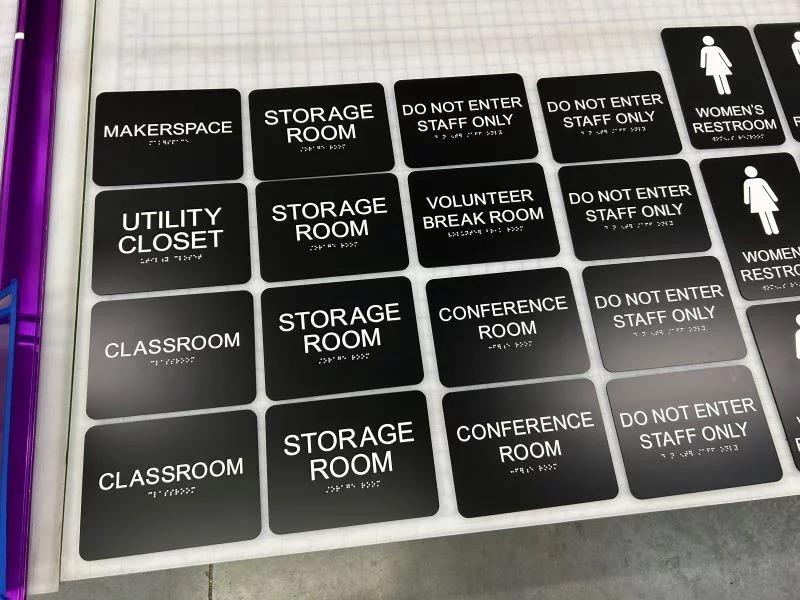
2. Ignoring Braille Requirements
Braille is a critical part of ADA signage, yet many businesses either leave it out or use the wrong format. ADA guidelines specify the use of Grade 2 Braille, which includes contractions to make reading faster and easier for those who are visually impaired.
Tip: Work with a professional sign company experienced in ADA compliance to ensure that Braille is correctly sized, positioned, and formatted.
3. Using Non-Contrasting Colors
Directional signs must be easy to read from a distance, especially for people with low vision. A common mistake is choosing sign colors that do not contrast enough with the text. For example, dark gray text on a black background or light yellow on white can make the sign almost unreadable.
Tip: Always use high-contrast color combinations—like white text on a dark blue or black background, or black text on a white background—for maximum visibility.
4. Selecting Fancy or Decorative Fonts
Stylish fonts might look attractive, but they can make signs harder to read. ADA guidelines recommend using simple, sans serif fonts such as Arial, Helvetica, or Verdana. Decorative fonts, cursive lettering, or overly bold typefaces can cause confusion and reduce accessibility.
Tip: Keep fonts simple, clean, and large enough to be easily legible from a distance.
5. Placing Signs in Obstructed Locations
Another mistake is installing directional signs in areas where they are blocked by doors, furniture, plants, or decorations. If people cannot see or access the sign easily, it defeats the purpose of having it.
Tip: Before finalizing installation, walk through your building as if you were a first-time visitor. Make sure signs are visible, unobstructed, and logically placed at key decision points (hallways, elevators, restrooms, exits).
6. Forgetting Illumination or Visibility in Low Light
Directional signs should remain visible even in dim lighting or emergency situations. Businesses often forget to install signs with proper lighting or use materials that reflect poorly in low-light conditions.
Tip: Consider non-glare finishes and ensure signs are positioned in well-lit areas. For critical wayfinding, use illuminated signs that remain visible during power outages.
7. Using Inconsistent Signage
Inconsistency creates confusion. Some businesses mix different styles, colors, or placement heights for their directional signs. This not only looks unprofessional but also makes navigation harder for people with disabilities.
Tip: Establish a uniform signage system across your facility. Keep design, color schemes, font style, and mounting height consistent.
8. Overlooking Exterior ADA Directional Signs
Businesses often focus only on interior compliance while forgetting about exterior directional signs. Parking lots, building entrances, and pathways also require ADA-compliant signage to guide people safely.
Tip: Make sure accessible routes, parking spaces, and building entry points are clearly marked with ADA directional signs that follow compliance rules.
9. DIY Installation Without Professional Guidance
Some businesses attempt to cut costs by designing and installing ADA directional signs themselves. Unfortunately, this often leads to non-compliance and costly replacements later. ADA requirements are detailed, and even a small mistake in Braille placement, color contrast, or mounting height can put you at risk.
Tip: Work with a professional signage company that specializes in ADA compliance. They understand the legal requirements and can help you avoid expensive mistakes.
10. Not Updating Signs Over Time
Finally, many businesses overlook updating their signage when layouts change. Renovations, office relocations, or changes in building use can make directional signs outdated and misleading.
Tip: Review your ADA signage regularly and update whenever there are building changes to keep navigation clear and compliant.
Final Thoughts
ADA directional signs are more than just a legal requirement—they are an investment in accessibility, inclusivity, and customer experience. Avoiding common mistakes such as incorrect placement, poor color contrast, or missing Braille ensures your building is easy to navigate for everyone.
By working with a professional signage partner and staying mindful of ADA guidelines, you’ll not only stay compliant but also create a welcoming environment where every visitor feels respected and supported.
Categorias
Leia Mais
Al Mamzar Beach Timing provides essential opening hours for visitors planning a perfect beach day. Enjoy sun, sand, swimming, and outdoor fun in Dubai’s most iconic beach park, ensuring a memorable experience.

Executive Summary U.S. Statin Market : CAGR Value The U.S. statin market size was valued at USD 4.59 billion in 2024 and is expected to reach USD 1.57 billion by 2032, at a CAGR of 1.50% during the forecast period U.S. Statin Market report has CAGR value fluctuations during the forecast period of 2018-2025 for the market. The report consists of remarkable data, present market...
Losing one or more teeth can affect more than just your smile—it can impact your confidence, speech, and overall oral health. If you’ve been exploring options for tooth replacement, you’ve likely come across the term “dental implants near me.” At we believe dental implants are one of the most reliable, long-term solutions for missing teeth. They not only...

The world of fashion often changes quickly, but some brands leave a long-lasting mark. Chrome Hearts and COMME des GARÇONS are two names that have done just that. Each carries its own identity, yet when they meet in a limited edition release, the impact is far greater than just clothing. This collaboration shows how limited collections can shape fashion, attract loyal fans, and build a...

Choosing the right forex broker can significantly impact your trading success. With thousands of brokers available online, navigating this vast marketplace can be overwhelming. This is where forex broker reviews come in handy, helping traders make informed decisions based on real experiences and expert analysis. In this Forex broker review website, we’ll break down everything you need to...