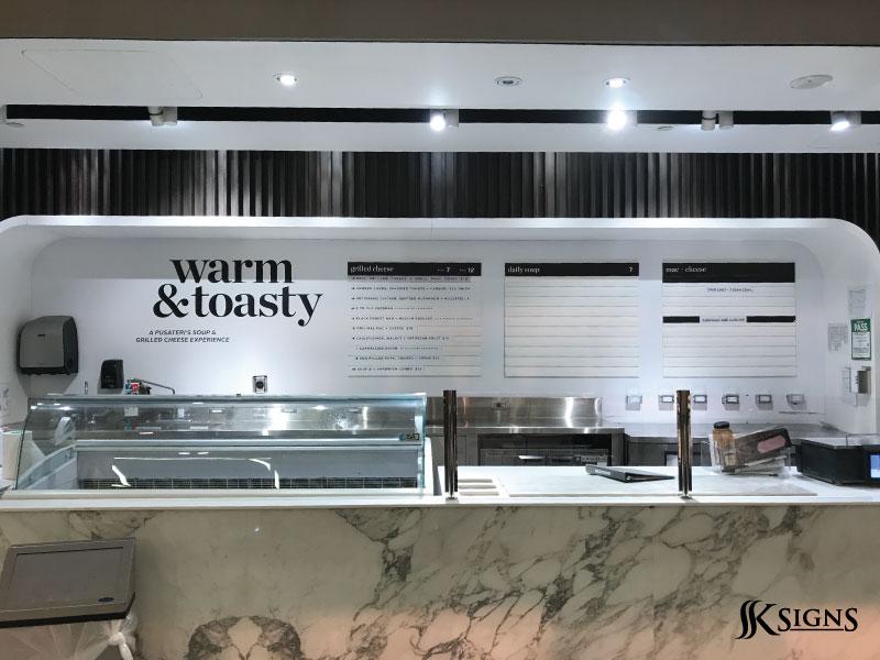
Design Tips for Eye-Catching Vinyl Signs in Mississauga

In the competitive business landscape of Mississauga, standing out is not just an option—it’s a necessity. Whether you’re running a local café, a retail store, or a professional service office, your signage plays a crucial role in attracting attention and communicating your brand’s identity. Among the many options available, custom vinyl signs have become one of the most versatile and cost-effective solutions for businesses.
Vinyl signs are durable, highly customizable, and adaptable to a wide range of applications, from storefront windows to vehicle graphics. But the real question is—how do you design vinyl signs that truly catch the eye? In this article, we’ll share practical design tips that can help Mississauga businesses create impactful vinyl signage that grabs attention and leaves a lasting impression.
1. Keep It Simple and Readable
When it comes to signage, less is often more. The human eye processes simple, clear messages much faster than complicated designs. Avoid clutter by focusing on essential details such as:
-
Your business name or logo
-
A short tagline or value proposition
-
Contact information (phone, website, or social media handle)
A busy sign may overwhelm viewers and fail to communicate its message. Instead, use clean layouts with strategic white space to ensure your design feels professional and approachable.
2. Choose High-Contrast Colors
Color plays a huge role in visibility and brand recognition. For vinyl signs to stand out in Mississauga’s busy streets, opt for high-contrast combinations—such as black text on a yellow background, or white text on a dark blue background.
A few rules to remember:
-
Light colors work best on dark backgrounds and vice versa.
-
Use your brand’s color palette but adapt it for maximum readability.
-
Limit your design to two or three core colors to maintain consistency.
Remember, your sign should be legible from a distance, whether it’s a window graphic in Square One Mall or a vehicle wrap driving along Hurontario Street.
3. Select Fonts Wisely
Typography can make or break a vinyl sign design. Fancy fonts may look appealing up close, but they often become unreadable from a distance. Stick to bold, sans-serif fonts for clarity. Popular choices include Helvetica, Arial, or Futura.
A few font tips:
-
Limit yourself to one or two fonts per design.
-
Use bold or uppercase for emphasis, but avoid overusing it.
-
Ensure text size is large enough to be seen from afar (1 inch of letter height for every 10 feet of viewing distance).
Clear, easy-to-read fonts ensure your message is absorbed instantly.
4. Incorporate Strong Branding Elements
Your vinyl signs should do more than just deliver a message—they should reinforce your brand identity. Incorporate your logo, brand colors, and tagline consistently across all your signage. This creates a sense of familiarity and professionalism.
For example, a Mississauga bakery could use vinyl window lettering with their signature colors and fonts to match their packaging. Consistency builds trust and makes your business more memorable.
5. Use Imagery Strategically
Vinyl signs give you the freedom to include graphics, photos, or icons. However, images should enhance the design—not overcrowd it. Use high-resolution visuals that align with your brand and communicate your message instantly.
For example:
-
A fitness studio could display bold action shots of people exercising.
-
A salon might showcase sleek hairstyles or beauty icons.
-
A real estate agency could use clean icons of houses to reinforce their services.
Choose visuals that resonate with your target audience in Mississauga’s diverse community.
6. Think About Placement
Even the most stunning vinyl sign won’t be effective if it’s poorly placed. Before finalizing your design, think about where the sign will be installed.
-
Storefront windows: Choose large, bold lettering that contrasts against reflections.
-
Wall graphics: Make sure the design aligns with your interior aesthetic.
-
Vehicle wraps: Keep text short and position it where drivers and pedestrians can read it quickly.
Good design adapts to its environment. A sign at Mississauga Celebration Square may need to stand out in a busy outdoor space, while a vinyl decal inside a quiet office can afford more subtlety.
7. Prioritize Durability and Quality
Mississauga’s weather can be unpredictable, with hot summers and snowy winters. That’s why choosing quality vinyl material is just as important as the design itself. High-quality vinyl ensures your colors remain vibrant and your graphics don’t peel or fade over time.
Investing in professional installation also ensures your signs look flawless—bubbles, wrinkles, or crooked placement can ruin even the best design.
8. Test Before You Print
Before finalizing your vinyl sign, always request a digital proof or mock-up. This allows you to check for spacing, alignment, and readability. Better yet, print a small sample and view it from the intended distance.
Sometimes a design looks great on a computer screen but doesn’t translate well in real life. Testing ensures your investment pays off with maximum impact.
Conclusion
Custom vinyl signs are one of the most powerful marketing tools for Mississauga businesses. They’re versatile, cost-effective, and capable of making a strong visual impact when designed correctly. By keeping designs simple, choosing the right colors and fonts, incorporating branding, and considering placement, you can create vinyl signage that turns heads and drives customer engagement.
Whether you’re looking to decorate your storefront in Port Credit, advertise on a delivery vehicle across Erin Mills, or add interior graphics to your office in Meadowvale, following these design tips will ensure your vinyl signs stand out in Mississauga’s competitive market.


