Baltimore Colts Logo
The Story of the Baltimore Colts Logo
Origins & Team Background
-
The Baltimore Colts were an NFL franchise from 1953 to 1983. Wikipedia+1
-
The name “Colts” reflected Baltimore’s history of horse breeding and racing. Wikipedia+1
-
In 1984, the franchise relocated to Indianapolis, becoming the Indianapolis Colts, carrying forward much of the branding heritage. Wikipedia+1
Early Logos and Uniforms
-
In the early years (mid-1950s), the team did not have a consistent official logo design. Uniforms and helmets underwent changes. Indianapolis Colts+3Retro Seasons+3Sports Logos+3
-
The horseshoe motif (which is now so strongly associated with the Colts) was introduced gradually:
-
First appearance on the helmet in 1954: white horseshoe(s) on a blue helmet. Wikipedia
-
In 1956, they changed the helmet to white, with blue horseshoes. Wikipedia+1
-
By 1957, the design evolved into the more familiar version: a white helmet with a blue stripe down the center plus a blue horseshoe on each side. Sports Logos+1
-
Primary Logo: 1961-1978
-
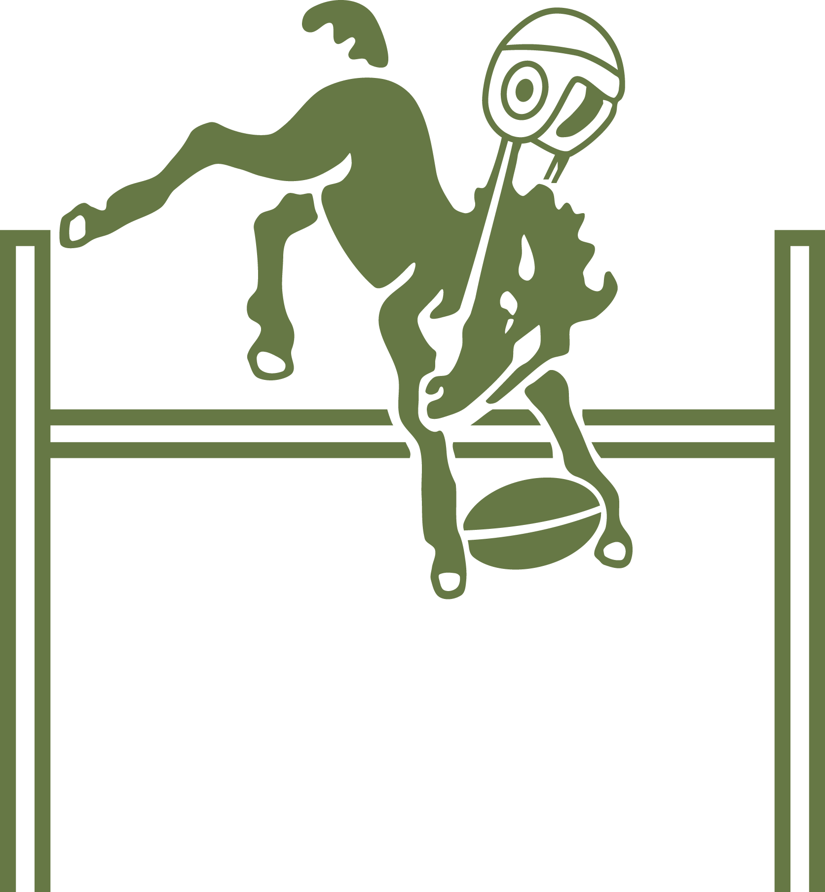
During 1961–1978, Baltimore used a more illustrative primary logo: a blue “bucking colt” (a young horse) carrying a football, wearing a Colts helmet. Sports Logos
-
This logo captured more energy and character—the imagery of a colt in motion suggests youth, power, and speed. It also made the logo more illustrative and less abstract compared to just the horseshoe. Sports Logos+1
Horseshoe Becomes the Symbol
-
Over time, the horseshoe logo became the emblem most commonly associated with the Colts—simple, bold, and instantly recognizable. Sports Logos+2Indianapolis Colts+2
-
It serves as the wordmark / helmet logo, particularly visible on the helmets from 1957 onward. Indianapolis Colts+1
Variations & Wordmarks
-
Through its history, the Colts had various wordmark logos (team name styles), uniform changes, helmet stripes, color-shifts in shades of blue and white, etc. Sports Logos+1
-
Their primary colors were royal blue, white, and silver. Wikipedia+1
Legacy & Meaning
-
The Colts’ logo is more than just branding; it represents several eras of NFL history:
-
Their championships in Baltimore (notably 1958, 1959, and 1968). Wikipedia+1
-
The Unitas era and the foundational years of football becoming big in America. Wikipedia+1
-
The move to Indianapolis didn’t erase the Baltimore history—the franchise carried the horseshoe and team continuity forward. Wikipedia+1
-
-
The horseshoe symbolizes luck in many cultures, especially when “upright”—a shape that suggests holding luck, rather than letting it spill out. Whether that was part of the original intentional design is less certain, but it’s become part of how fans interpret it. Reddit
Modern Impacts & Use
-
The Colts (now in Indianapolis) still use the horseshoe prominently. The classic imagery has strong emotional resonance; vintage Colts logos are beloved by many fans.
-
Even though the “bucking colt with a football” logo is no longer in primary use, it's still a part of logo history and collectibles.
Design Lessons & Takeaways
From the Baltimore Colts logo evolution, some useful design takeaways:
-
Simplicity helps longevity: The horseshoe is a simple icon—easy to reproduce, memorable, and scalable.
-
Symbolism matters: Choosing a symbol with local or thematic relevance (horseshoes, colts) strengthens brand identity.
-
Iteration over reinvention: The Colts made gradual changes—helmet color, stripe, logo style—rather than radical rebrands, which helped maintain recognition.
-
Visual balance & visibility: The placement on helmets, color contrast (blue on white, etc.) was designed for visibility and clarity in motion (on the field) and at distance (fans, TV).
الأقسام
إقرأ المزيد
Genesis College of Health, located at the Alberta Academy of Aesthetics in Edmonton, provides world-class training through their accredited programs. Students acquire a range of skills and knowledge that can help with their entry into a rapidly expanding field with numerous opportunities in Health Safety and Aesthetics. Training is centered in practical, hands-on approaches to learning at the...
"Executive Summary E-Prescription Market : The global E-prescription market size was valued at USD 110.29 billion in 2024 and is expected to reach USD 273.08 billion by 2032, at a CAGR of 12.00% during the forecast period. The market growth is largely fueled by the growing adoption and technological advancements within digital health ecosystems and...
When it comes to maintaining good oral health, choosing the right dentist can make all the difference. Whether you’re seeking routine cleanings, advanced procedures, or emergency care, you’ve probably searched online for phrases like “Best Dentist Near Me” or “Dentist Near Me.” With so many options to choose from, finding a trusted dental practice that offers...

Raspberry Hills Clothing: Redefining Streetwear with Comfort and Creativity Introduction to Raspberry Hills Clothing Raspberry Hills Clothing is a rising name in the world of streetwear, known for its unique blend of creativity, comfort, and culture. The brand has quickly caught the attention of fashion lovers for its bold graphics, oversized fits, and clean color palettes. With every...

Western Australia is renowned for its expansive landscapes, mineral-rich soils, and booming resource industry. With this vastness comes the unique challenge of housing a transient workforce in remote areas where traditional infrastructure is often scarce. Stepping up to meet this challenge is Remote Group WA, a company that has firmly established itself as a leader in Mining Camp Builders...