Make Readers Click: Essential Features of High-Converting Book Covers
Everyone says "don't judge a book by its cover", but that is exactly what everyone does, especially readers looking for a book. In the publishing industry, the cover is not only a protective jacket for a book but also a powerful marketing tool.
As readers are going through the shelves at bookstores or scrolling through online platforms, it is the cover that grabs their attention first. Sometimes, a cover helps them decide in a split second if they want to buy it or not.
Did you understand what you need? It is a compelling cover that will make readers pause their browsing and urge them to pick up the book.
This shows the importance of understanding the psychology of cover design. You need to make it irresistible for onlookers. This article will explore all the essential features of high-converting book covers and highlight strategies that can transform your book cover.
Strategies for Creating Top-Notch Book Covers
Here is everything you need to know about converting your book into a marketing spectacle.
The Role Of First Impression
A book cover is the first thing a potential buyer would come across before reading the content. A well-designed cover silently communicates the genre, tone, and quality of the work.
Moreover, a high-converting book cover captivates the readers and gives a good impression of what they are going to experience inside the pages.
Let's take an example of a romance novel where tender typography and a pastel colour scheme convey cosiness and intimacy. A thriller featuring bold, sharp letters with a dark backdrop conveys suspense and danger.
Genre Alignment And Reader Expectation
To design a successful book cover, you need to make sure that it instantly signals your book's genre to the reader. Utilise the visual cue to capture people's attention and see if it matches their interests. Alignment is the key to conversion.
● Visual cues matter: Fantasy readers expect illustrations like enhanced forests, swords, mystical creatures, or magical symbols. In contrast, non-fiction readers look for clean, minimalistic designs.
● Avoid confusion: Remember to stay within the genre norms so you don't mislead or alienate the potential buyer.
● Balance is the key: Although covers should adhere to well-known clichés, they should also have distinctive elements that set the book apart.
● Instant clarity: It should be clear from the design that this book belongs to the preferred genre.
Distinctive Typography As A Visual Anchor
When designing a book cover, one of the key elements to look for is the typography. It consists of font choice, size, and placement that match the book's tone and genre to instantly capture attention.
Here are some of the popular genres:
Fiction
● Serif Font: Provide a timeless, classic vibe that works well with historical or literary works.
● Sans-Serif Font: Give it a sleek, modern appearance that is perfect for modern fiction.
● Readability: Author names and titles need to be readable, even at thumbnail size.
Thrillers and Mystery
● Bold uppercase lettering: Conveys intensity, anxiety, and suspense.
● High contrast designs: Make the title pop against dark or moody backgrounds.
● Sharp spacing: Adds an edge that matches the intensity of the genre.
Romance
● Cursive or script fonts: They suggest elegance, intimacy, and softness.
● Gentle curves and flourishes: Mirrors emotional themes and warmth.
● Light colour pairing: These are used to balance soft typography with inviting visuals.
Non-Fiction
● Clean professional fonts: Communicate authority, clarity, and trust.
● Minimalistic layouts: Keep focus on the title rather than the decorative elements of the book.
● Strategic emphasis: Keywords in the title may be highlighted with weighted colours.
High-converting covers treat typography as the anchor of everything. This ensures that the design is both eye-catching and informative.
Colour Psychology And Emotional Impact
Colours have the power to evoke emotions and create a certain mood. A marketing study shows that up to 80% of brand recognition is based on colours.
This also applies to books, as the colour palette on the cover reflects the theme and atmosphere of the story.
Examples of a few colour schemes:
● Warm tones such as red and orange evoke passion, energy, and urgency
● Cool tones such as blue and green suggest calm, trust, and reflection
● Black and gold imply luxury and authority
A careful selection of colours gives a book cover design UK emotional resonance with the reader.
Imagery and Symbols
The pictures on your cover should tell a tale and arouse curiosity rather than just serving as decorations. Effective covers may use imagery or symbolism to hint at the topic of discussion without giving away too much.
To give an example, a historical fiction novel may make use of one iconic object, like a pocket watch or an old letter, to create a feeling of time and mystery. Non-fiction covers tend to include symbolic images that support authority, including light bulbs or arrows pointing up to encourage business growth.
The best imagery is one that is carefully chosen and sparks interest without providing all the answers. This provokes curiosity and encourages people to continue researching the book.
Simplicity Vs. Design
A book cover maker makes sure that the cover doesn't need to be crowded with elements to stand out. Give the following tips a thought when designing a cover:
● Too many fonts, colours, or images make a font look messy.
● Clean, focused designs are preferred because they clearly highlight the core message.
● Minimalistic covers perform better in online stores, especially as thumbnails.
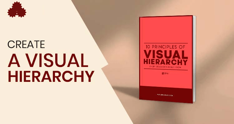
● A visual hierarchy helps guide the reader's eye.
● A simple design feels professional and makes the book more clickable.
Consistency With Author Branding
Authors who follow a similar genre or work on a series of books often need to maintain their brand consistency throughout their books.
This is necessary for people to recognise their work and also to stand out in a competitive marketplace. For that, many authors hire a professional book illustration service. The reason is that they know how to select themes, tone, typography, and layout according to the author's brand.
For example, Lee Child's Jack Reacher series or J.K. Rowling's Harry Potter series. They all keep a consistent style across their books with their covers.
Frequently Asked Questions
1. How does a book cover influence online sales?
An attention-grabbing thumbnail might be the difference between getting clicked on and being ignored on sites like Amazon.
2. Is it possible that you redesign a book cover after the book's release?
Many authors and publishers do that as they aim to rebrand, target new audiences, and improve sales performances.
3. Why are book covers considered marketing tools?
Book covers serve as visual ads, drawing readers in and immediately affecting their decisions to make a purchase.
Conclusion
A book cover is a sales tool and not a decorative item. First impressions are formed under the influence of every detail, such as typography and colour psychology.
It also includes imagery and the genre match. High-converting covers are those that look creative and clear, but not confusing.
They are all aligned with the brand of an author, in print, digital, and audiobook formats. In a crowded marketplace, the cover acts as a quiet salesman. For authors who want to get noticed and bought, learning how to design a great cover is not a choice; it is a must.
Categorias
Leia mais
Executive Summary Sports Nutrition Market : The global sports nutrition market was valued at USD 21.71 billion in 2024 and is expected to reach USD 48.13 billion by 2032, During the forecast period of 2025 to 2032 the market is likely to grow at a CAGR of 10.46%. Sports Nutrition Market report can be explored in terms of breakdown of data by...
In today’s competitive candle market, packaging does more than just protect your product—it conveys your brand story, evokes emotions, and influences purchasing decisions. As the demand for artisanal and luxury candles grows, brands are faced with an important design choice: Should your candle packaging be minimalist or bold? The answer depends on your brand identity, target...
"Executive Summary Aircraft Electrical Systems Market : CAGR Value The global aircraft electrical systems market size was valued at USD 23.55 billion in 2024 and is expected to reach USD 37.82 billion by 2032, at a CAGR of 6.10% during the forecast period. This market research report is an utter outline of the global industry which is penned down so...

Executive Summary High Density Polyethylene (HDPE) Resins Market : High density polyethylene (HDPE) resins market size is expected to grow at a compound annual growth rate of 5.46% for the forecast period of 2021 to 2028. This global High Density Polyethylene (HDPE) Resins Market report is comprehensive and opens a door of international market for the products. Client’s...
Cancer and its treatments can cause many debilitating symptoms, including pain, nausea, appetite loss, sleep disruption, anxiety, and nerve-related issues. Patients struggling with these symptoms are always seeking an alternative natural remedy which is safer with few side effects. For many patients, Medical Marijuana is a good option that can ease these symptoms. It is not a treatment or a...