The Best Interior Paint Colours to Increase Your Home Value

A fresh scheme can completely reset the way a home feels. Subtle shifts—warmer whites, softer greys, a grounded green in the right corner—shape how rooms connect and how buyers imagine life there. When colours flow and finishes look crisp, the whole place feels well cared for and ready to move into. I usually start with the layout and the light: which walls carry daylight, which corners need calm, and which areas should draw the eye. Matching sheen to function matters just as much, because surfaces need to hold up to everyday use. To get that balance right, many homeowners turn to professional interior painting services as a way of ensuring the result looks polished and consistent across every room.
What buyers notice first in painted interiors
A colour update does more than tidy walls—it sets expectations for the whole property. Use paint to frame light, calm busy zones, and guide movement from room to room.
-
Unify sightlines with one dominant neutral carried through open areas.
-
Reserve deeper tones for smaller planes or features to anchor the palette.
-
Keep trims consistent to signal order and reduce visual noise.
-
Match sheen to use: low-sheen for living spaces, washable finishes for high-touch zones.
Short story from the field: I once walked a compact terrace where every room fought for attention—cool grey in the lounge, yellow in the hall, bright blue in a bedroom. We repaired the story with a warm white base and one muted blue feature in the main room. The home felt larger, calmer, and, importantly, coherent.
Colour palettes that lift perceived space
Colour can lengthen a hallway, soften a corner, or balance strong floors. Think in layers: wall tone, trim, doors, then small accents. Keep the temperature consistent so daylight doesn’t swing rooms from warm to cold.
-
Soft whites with a touch of warmth flatter timber floors and north-facing rooms.
-
Gentle greys steady bright spaces, and complement modern fixtures.
-
Muted greens or dusty blues add calm without stealing light.
-
Earthy beiges and greiges bridge older details with newer fittings.
Tip: Sample at scale. Paint two A3 boards per candidate colour and move them around at different times of day. This keeps decisions grounded in your home’s actual light rather than a tiny swatch.
Workmanship and accountability: why licensing matters
Great colour choices still depend on sound preparation and clean application. Corners, cut lines, and surface prep make or break the result. Primer compatibility, filler choice, and correct drying windows all show up in the finish. Before anyone lifts a brush, verify credentials and scope so standards are clear.
-
Confirm scope: surfaces, coats, primers, and finishes per room.
-
Ask how they stage rooms to protect the flooring and fittings.
-
Check their plan for ventilation and low-odour products where needed.
-
Align on the lean-up and touch-up protocol before the first coat.
In New South Wales, painters are expected to hold specific credentials to carry out residential work. Understanding NSW painting licence requirements gives you confidence that the job is being done by someone operating to recognised standards, which helps ensure the finish will last and the process runs smoothly.
Room-by-room ideas that create flow (without feeling samey)
A palette can be cohesive without being flat. Use micro-shifts in depth and temperature to keep rooms connected while giving each a role.
-
Living spaces: warm white walls, crisp semi-gloss trims, a single accent on joinery.
-
Bedrooms: quiet mid-tone neutrals to soften early light, low-sheen finishes.
-
Kitchens: durable washable finishes near prep zones, neutral walls to let benchtops stand out.
-
Bathrooms: moisture-resistant paints, pale tones to bounce limited light.
When I revisit projects months later, the homes that still feel fresh are the ones where colour supports function. The best compliment is when visitors remember how the home felt, not the paint itself.
Palette decisions with expert input
Choosing between two close neutrals can stall a project. Light orientation, existing floors, and ceiling height all pull colours in different directions. A structured consultation shortens that loop and gives you a documented scheme to follow across spaces.
-
Map light: note where rooms face and how shadows travel.
-
Test edges: compare how the colour behaves beside trims and doors.
-
Calibrate sheen: lift durability in high-touch areas without adding glare.
-
Stage the sequence: paint darker accents last to protect edges.
Looking at approaches to colour consultation for home interiors shows how small adjustments—like tweaking undertones or balancing warm and cool shades—can help each room connect to the next without feeling repetitive.
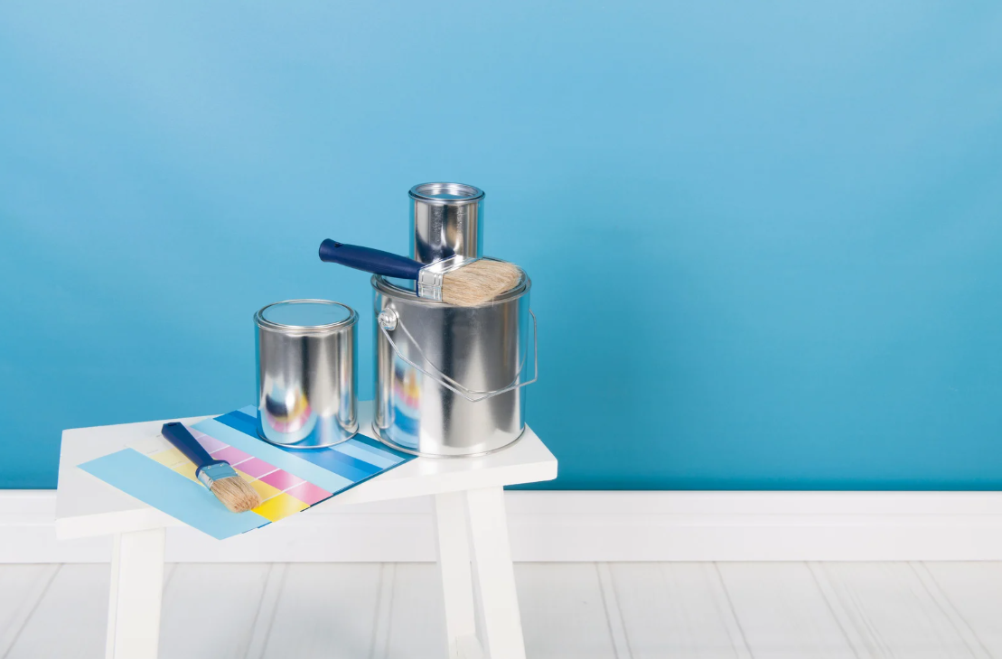
Finishes and tools that support a durable result
Quality products help colours sit true and last longer. Primers bond the system, rollers control texture, and brushes shape edges. Even the right tape choice keeps lines sharp and cleanup simple.
-
Use dedicated primers over repairs to prevent flashing and patchiness.
-
Match roller nap to substrate: lower nap for smooth walls, higher for light texture.
-
Keep a consistent brand system across primer, undercoat, and topcoat.
-
Label leftover tins by room and surface for easy future touch-ups.
Experienced painters often rely on tried-and-true combinations of products and gear. Exploring what professionals consider the best paints and tools for interiors helps homeowners understand why certain brushes, rollers, and coatings consistently deliver a cleaner, longer-lasting finish.
Final thoughts
Colour sets tone; workmanship seals the impression. Start with the way light moves through your rooms, choose a small family of colours that speak to your flooring and fixtures, and apply with care. Keep trims tidy, sheens appropriate, and transitions calm. With a cohesive palette and a disciplined finish, your interiors project reads as thoughtful and ready for the next chapter—exactly what turns a walkthrough into a clear “yes”.
Categorie
Leggi tutto
"Executive Summary LAL Testing Market : CAGR Value The global LAL testing market size was valued at USD 229.94 million in 2024 and is expected to reach USD 458.18 million by 2032, at a CAGR of 9.00% during the forecast period. The market insights and market analysis about industry, made available in this LAL Testing Market research report are...
온라인 토토 시장은 빠르게 확산되며 다양한 혜택을 제공하고 있다. 그중에서도 토토 꽁머니 10000은 많은 이용자들이 주목하는 이벤트 중 하나다. 이는 신규 가입자뿐 아니라 기존 회원에게도 매력적인 조건을 제공하면서 실질적인 체험 기회를 마련해 준다. 초보자에게 최적의 기회 처음 토토를 접하는 사람들에게 가장 어려운 점은 자금을 잃을 수 있다는 불안감이다. 토토 꽁머니 10000은 실제 돈을 쓰지 않고도 다양한 베팅 방식을 경험하게 해준다. 규칙과 용어를 이해하고, 여러 종류의 배팅 유형을 시도하면서도 금전적 손실을 최소화할 수 있다. 소액 자금의 활용성 10,000원의 꽁머니는 금액적으로 크지 않아 보일 수 있다. 하지만 이를 적절히 활용하면...

According to the UnivDatos, the rising integration of AI APIs from the end-user industries would fuel the demand for AI API is further anticipated to grow. As per their “AI API Market” report, the global market was valued at USD 46,233 million in 2024, growing at a CAGR of about 31.6% during the forecast period from 2025 - 2033 to reach USD million by 2033. The AI API market is...

Executive Summary Brachytherapy Market : The global brachytherapy market size was valued at USD 1.2 billion in 2024 and is expected to reach USD 2.18 billion by 2032, at a CAGR of 7.8% during the forecast period Systematic, objective and exhaustive study of the facts related to any subject in the field of marketing have been performed while formulating this Brachytherapy...
In today's complex and competitive industrial landscape, businesses across manufacturing, construction, automotive, and energy sectors rely on advanced materials and tools to maintain efficiency, safety, and quality. Industrial products, ranging from adhesives and abrasives to personal protective equipment and electrical solutions, form the backbone of countless operations. These tools...